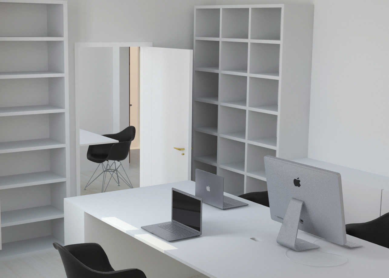
Hero banner I designed for the UK Amazon homepage to redirect customers to the Prime Now website
ROLE
Brand Design · Design Strategy · Art Direction · Production
Brand Design · Design Strategy · Art Direction · Production
SCOPE
Digital · Mobile · Social · Email · Print · US & Europe
Digital · Mobile · Social · Email · Print · US & Europe
THE CONTEXT
I joined the Amazon Prime Now brand design team in London in 2017, later supporting Amazon Fresh as well. Over the following two years, I worked across brand, marketing and merchandising projects for the US, UK, Germany, Spain, France and Italy, with additional support for Singapore during its initial launch.
My role covered everything from homepage and app graphics to social posts, emails, flyers, posters and direct mail, with a particular focus on maintaining a consistent brand position, visual language and customer experience across markets and platforms.
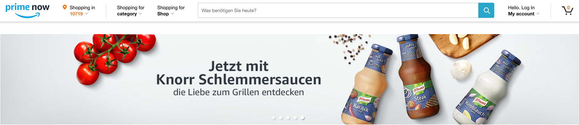
Hero banner I designed for the German Prime Now homepage
THE VISUAL LANGUAGE
Prime Now's visual world was built around a distinctive top-down perspective. Products were cut out and placed onto coloured surfaces drawn from the brand palette, with lighting and shadows added to give the compositions the dimensionality of a real photoshoot.
Because many of the assets were composites rather than traditional photography, the challenge was to make every composition feel intentional and cohesive — adding complementary props and stock elements to turn individual products into a visual story.
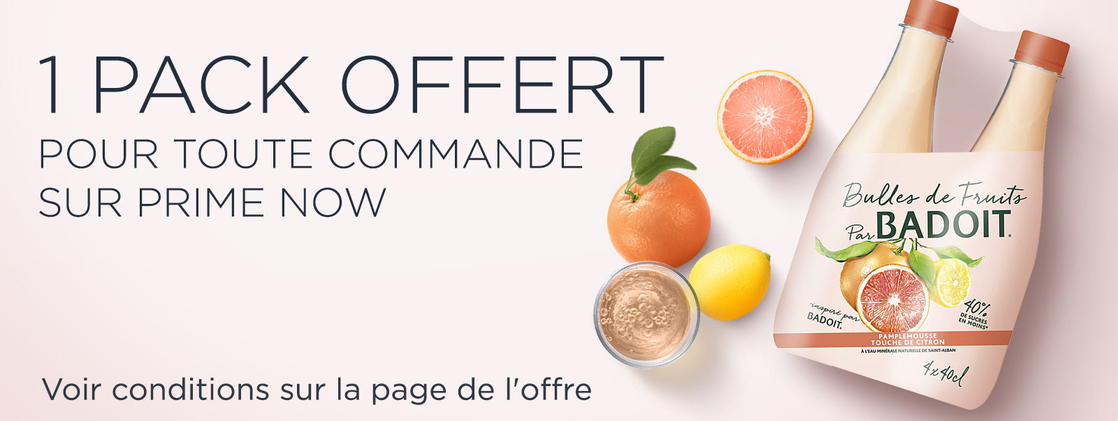
Banner I designed for the French Prime Now app
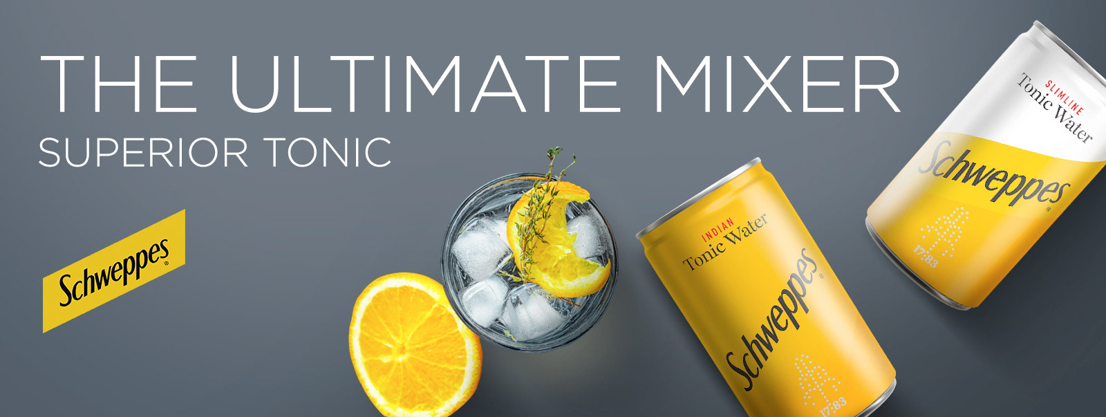
Co-op banner I designed for the UK Prime Now app


Co-op hero banners I designed for the Spanish Prime Now website

Pancake's Day hero banner I designed for the French Prime Now website
DESIGNING FOR TWO BRANDS
Amazon Fresh followed a similar product-compositing approach, but with a very different visual language: white backgrounds, a fixed two-column structure and a more functional grocery-focused aesthetic.
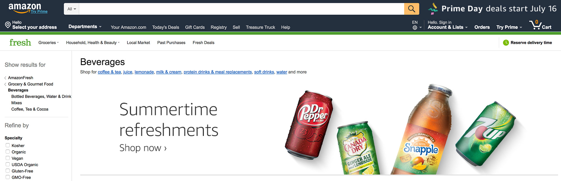
One of the desktop banners I created for AmazonFresh, on the US Amazon site
DESIGNING FOR CUSTOMER BEHAVIOUR
Brand consistency was only one part of the job. The Brand Design team worked closely with local Marketing teams to understand how customers were actually interacting with the platforms and use design to address specific customer behaviour.
In Spain, for example, customers were missing promotional offers because the app tiles looked too similar at first glance. I took on the role of Design Lead for a new visual treatment that would make offers more recognisable without disrupting the existing Prime Now design system.
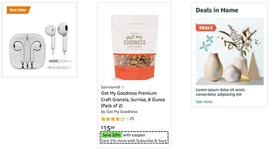
Across Amazon.com, bright orange and lime green were the two colours already used for badges
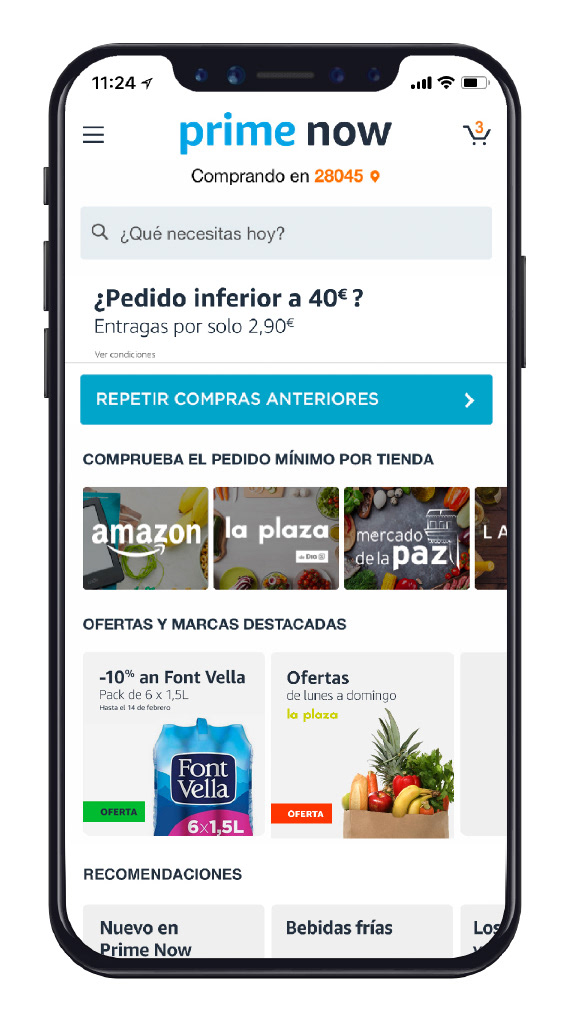
Mockup of the Prime Now app with both offer badges
The solution was an offer badge designed to be visually distinctive, compatible with existing Amazon conventions and simple enough for Marketing teams to integrate into their everyday production workflow.
Testing showed stronger engagement with the red version, but consultation with the UX team raised a broader accessibility and behavioural consideration: red was increasingly associated across Amazon platforms with errors or issues. We therefore recommended moving towards green as the more appropriate long-term direction.
THE OUTCOME
This was ultimately the kind of work I enjoyed most: balancing brand consistency with local customer behaviour, business objectives and practical production constraints — making design decisions that had to work not only aesthetically, but within a large and constantly evolving digital ecosystem.