First redesigned Prime Now direct mail — a tri-fold format sent to 120,000 customers in March 2018. The new layout combined lifestyle imagery, product discovery and concise service information within a more distinctive physical format.
ROLE
Creative Direction · Design Strategy · Art Direction
Creative Direction · Design Strategy · Art Direction
SCOPE
Prime Now · Prime Now + Amazon Fresh · UK & Germany · Customer acquisition & retention
Prime Now · Prime Now + Amazon Fresh · UK & Germany · Customer acquisition & retention
THE CHALLENGE
The original Prime Now direct mail was a traditional two-page leaflet packed with copy, small product images and information. It communicated the offer, but had little visual impact and struggled to stand out among the other mailers competing for attention.
The challenge was to make the format more engaging while giving customers a clearer way to understand the breadth of the service.
THE APPROACH
I redesigned the format as a tri-fold, replacing the dense product grid with a lifestyle-led top-down composition that could showcase a wider range of products across the panels.
The inside was structured around a simple what / when / how hierarchy, while additional space allowed for partner advertising and customer-facing elements such as an introductory letter, testimonials and promotional pull-out cards.

Mockup of intro letter and tri-fold leaflet with pullout plastic card on the promo page
TESTING THE FORMAT
We subsequently tested a simpler A5 version, with variations including a promotional pull-out card, to explore how much information could be removed while retaining the core proposition.

A5 flyer - front and back
ONE MAILER, TWO SERVICES
When the UK and Germany began offering Prime Now alongside Amazon Fresh, we needed to introduce both services within a single piece of communication without making either brand feel secondary.
The solution was a gate-fold format that treated the two services as parallel but distinct experiences. The front panel introduced the two propositions side by side, while the inside mirrored the structure and visual hierarchy for each brand.

Initial gate-fold concepts — exploring how two distinct Amazon services could share one physical format without competing for attention.
The concept was supported by playful copy developed with the copywriter, including lines such as "Sometimes you need bananas tomorrow / Sometimes you need them now."

Printed mockup of the German gate-fold leaflet
PREMIUM SELECTION
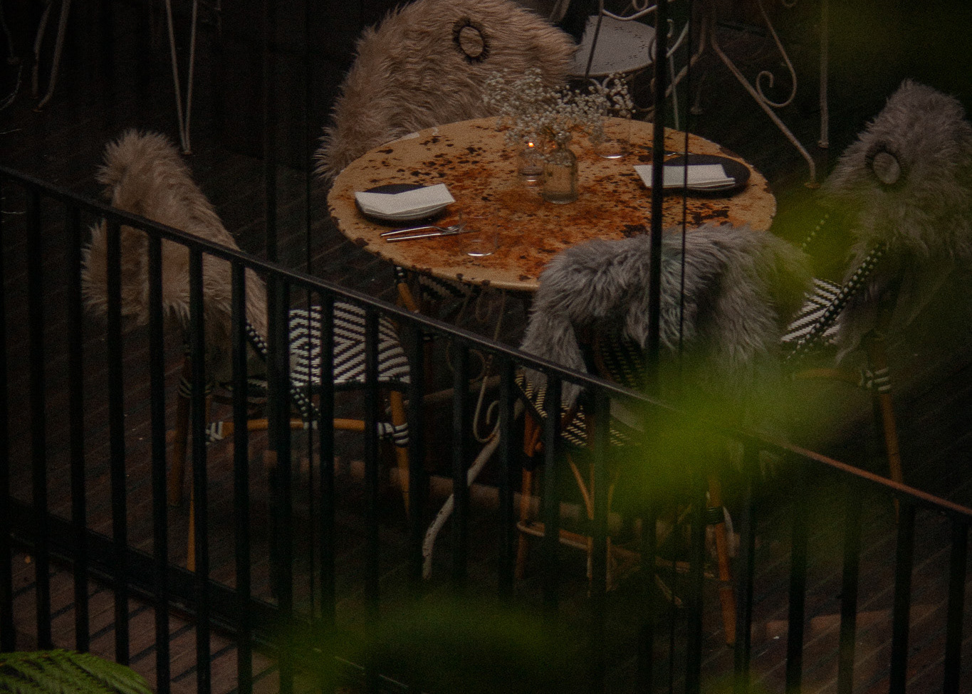
In 2019, a new direct mail campaign supported the launch of a more premium product selection. We introduced a darker, more elevated visual language and tested it across customer segments, alongside the existing creative treatment.
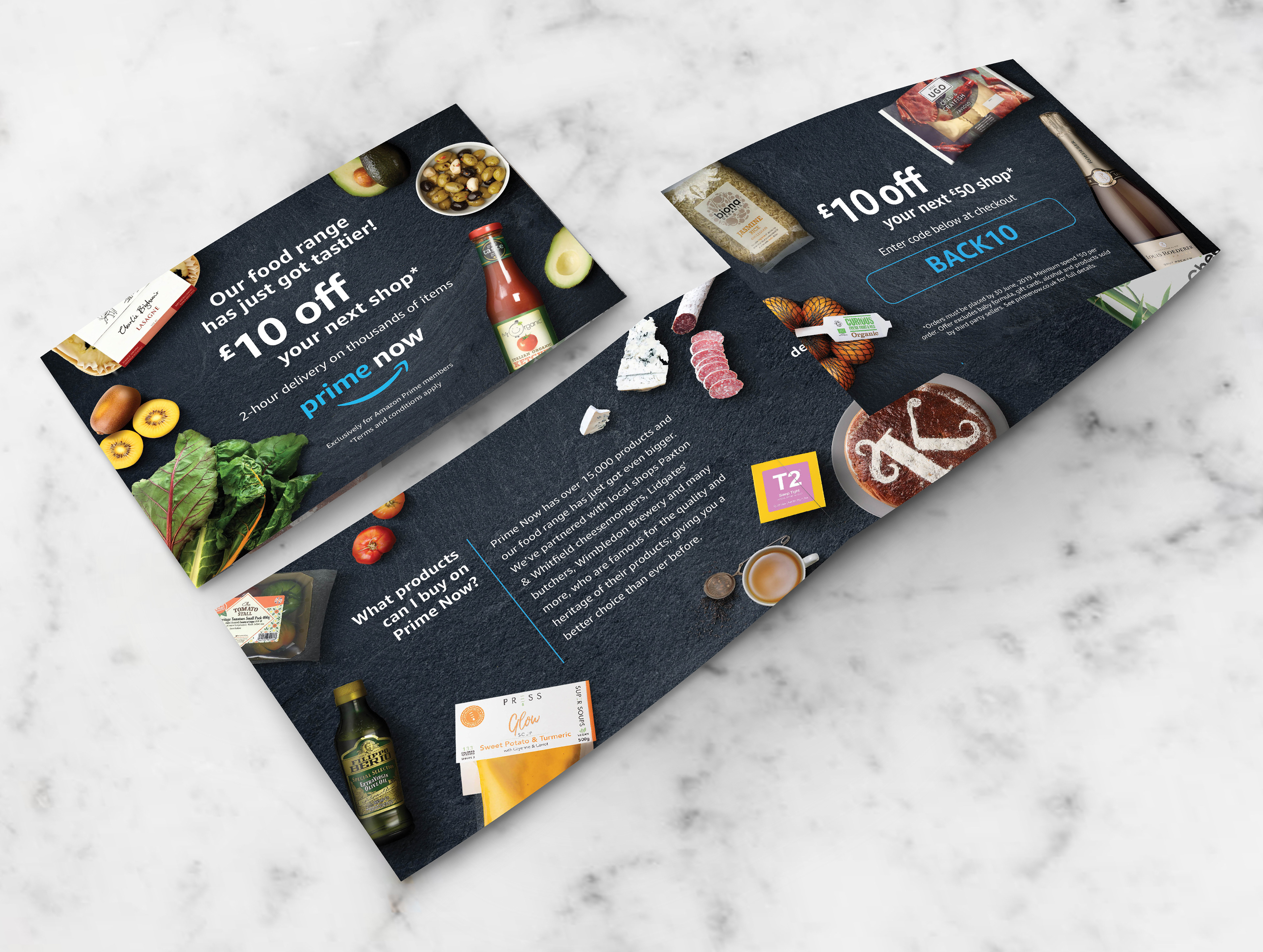
New design for a premium look and feel
OUTCOME
Both acquisition and existing-customer campaigns exceeded expectations, generating incremental orders over the following six weeks. The premium creative test also produced learnings that were used to optimise subsequent direct mail campaigns.
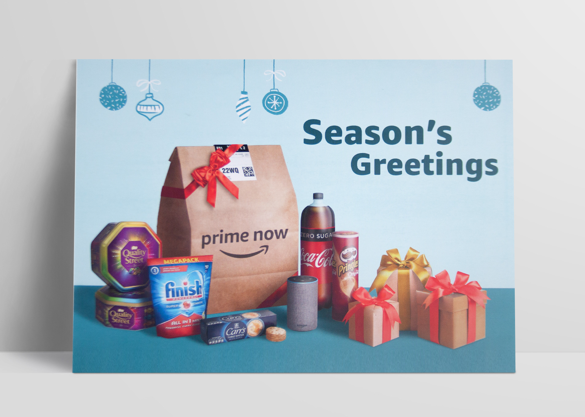
For the Christmas campaign, I carried the darker grocery-focused direction forward, integrating the global holiday colour palette and doodle system while transforming the introductory letter into a festive greeting card.