ROLE
Brand Identity · Art Direction · UI Direction
Brand Identity · Art Direction · UI Direction
SCOPE
Naming · Logo · Visual Language · Colour · App Interface
Naming · Logo · Visual Language · Colour · App Interface
THE CONCEPT
BECAUSE. was conceived as a mobile platform bringing people together to support one another while raising money for charity. The name itself comes from "be the cause", putting participation and collective action at the heart of the brand.
FINDING THE IDENTITY
The challenge was to translate a complex idea — community, collaboration, contribution and connection — into an identity that felt simple rather than overly designed.
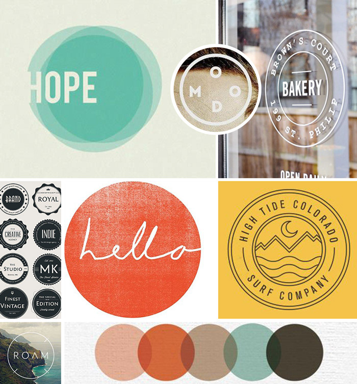
Visual references and early identity explorations

Exploring colour, warmth and the idea of “cause”

Early logo concepts — collaboration, connection and participation
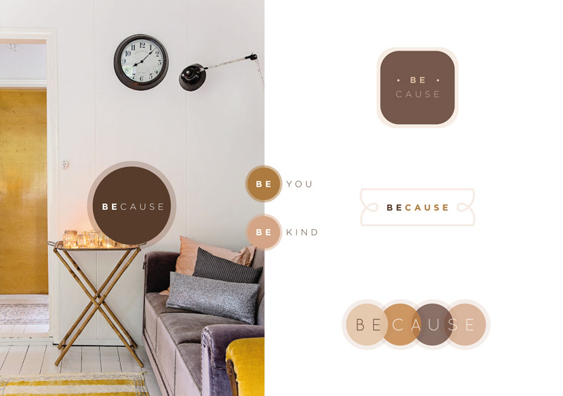
Exploring the “BE” within BECAUSE.

Developing the visual language through typography, colour and imagery
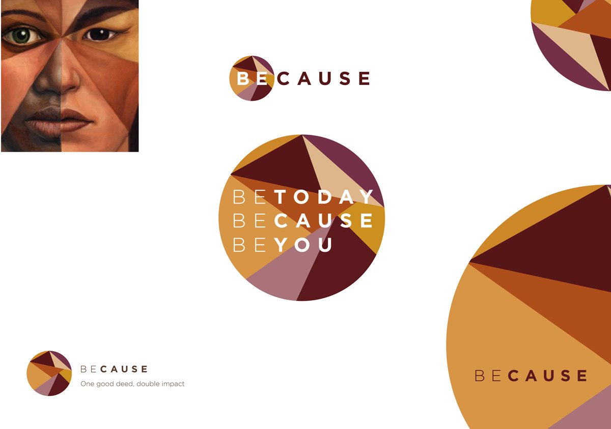
Exploring skin-tone-inspired palettes to introduce warmth and humanity
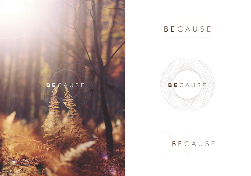
Refining the identity — simplifying the visual language while retaining a sense of connection

Final identity — roundness, transparency and controlled randomness within a structured system

FROM IDENTITY TO INTERFACE
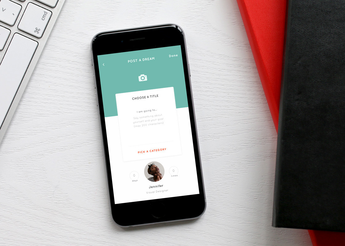
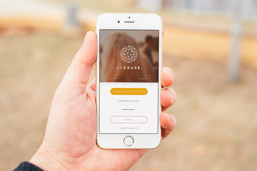
The final direction translated into a warm, minimal visual language for the app and its accompanying landing page. Rounded forms, transparency and a human-led colour palette helped carry the sense of openness and collective action into the digital experience.
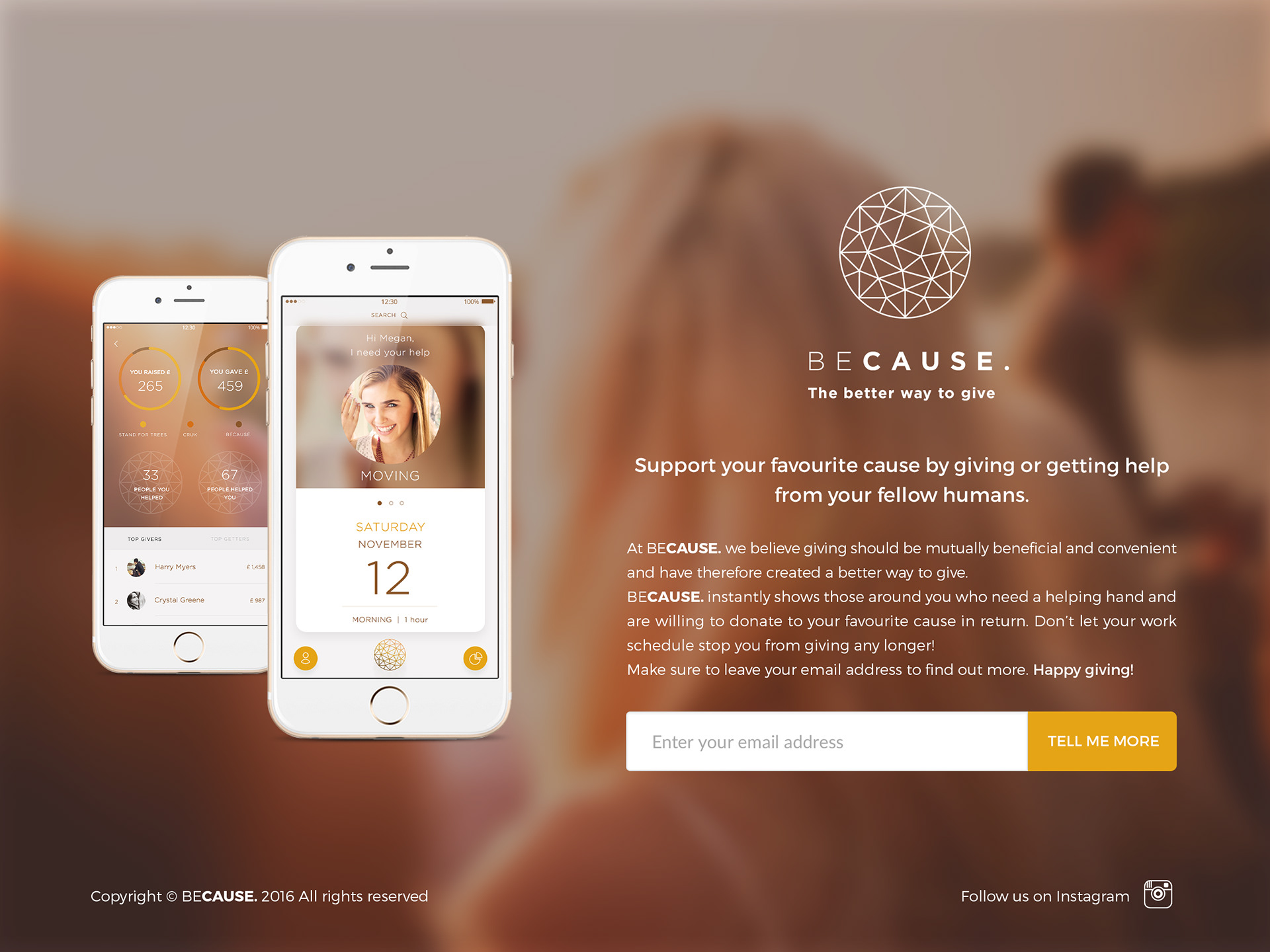
BECAUSE. — selected app interface and landing page applications